


I'm not really sure how long it has been since we have redesigned the website but we thought it was time!
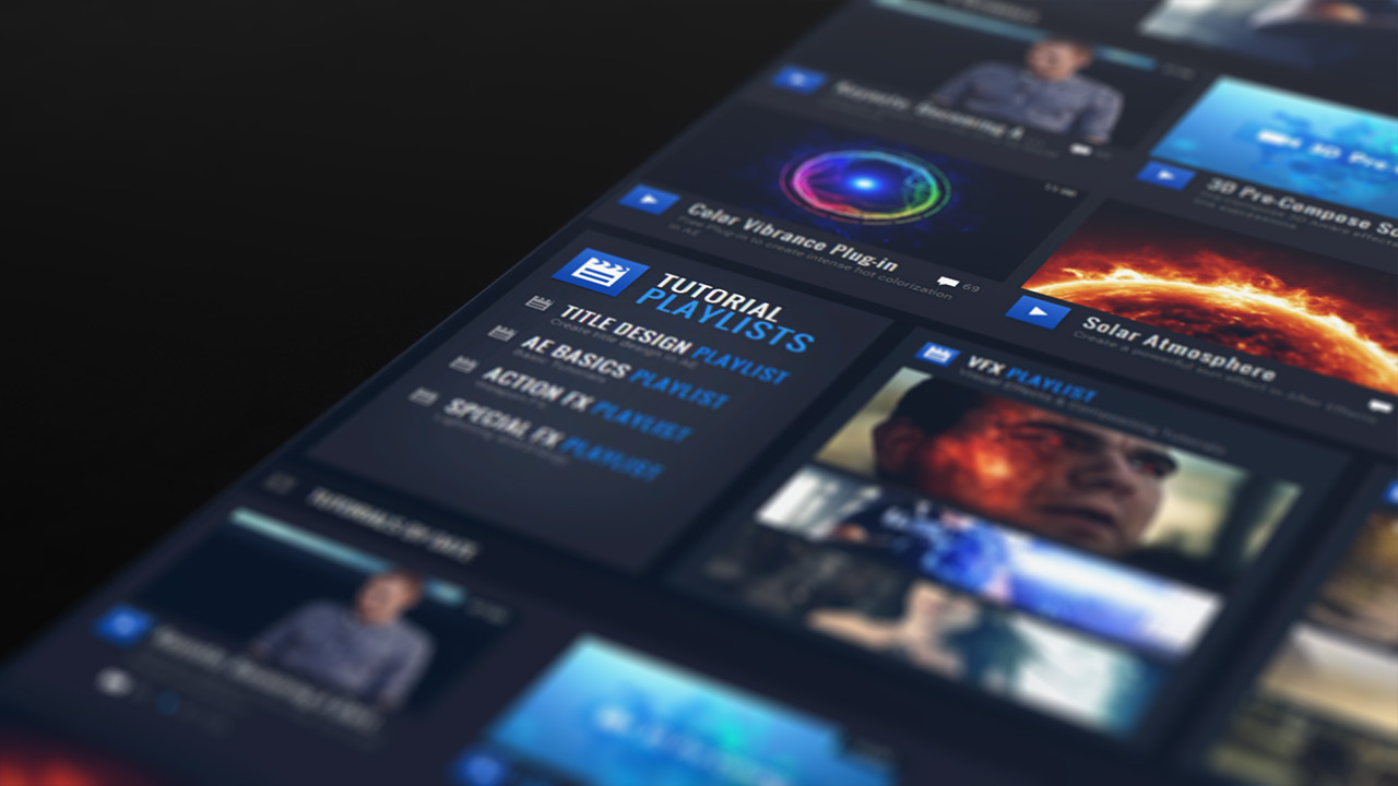
The new design is focused on content so we finally made the page wider. We've also updated the tutorial section so that you can watch the tutorial you click on with few clicks. The project file and related information is all in one place too. One of the bigger new features is the tutorial playlists. Right now, I've just created a few playlists of some of my favorite tutorials but what this mechanism will allow me to do is create more in depth training that has multiple parts and still fit into our typical system. Lots of important stuff behind the scenes!
Noted Features:
- Wider page width! (Dynamic sizes coming for mobile)
- Fewer clicks to access tutorials and content
- Tutorial Playlists
- Better resolution for embedded videos on blog
We are still transitioning so please give us time to get through all the small bugs, we're working on it!


 which is totally cool... Thumbs up....
 (
(