Video Copilot Website Update!

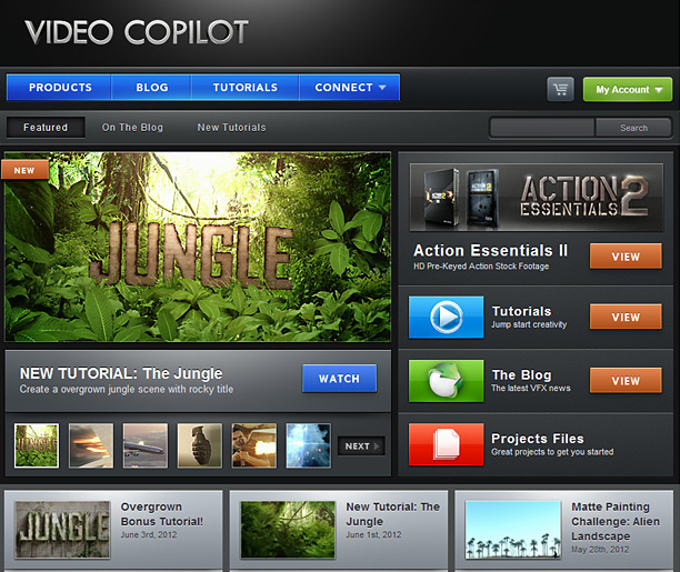
Today we updated our website with a slightly new look and layout. Our goal was to focus the content of the site and make it easy to see the stuff you want. We are also releasing a few products this year and we spent some time rebuilding our customer download system to make downloading products faster and easier. The new account system keeps track of your products so you can download anytime, anywhere. News about those products will be forthcoming soon but we need to get all the systems in place first. Stand by as we tweak the site and get the bugs out.

My favorite change is probably the wider blog space so the images and video can really stand out!

POSTED:
13 years ago
99 Comments
Manny
12 years ago
Great site! I have bought several of your products, including Element, and been very pleased. Good job with the tuts -- they're very entertaining and instructive, and make a great showcase for your products.
13 years ago
My variation of this includes animated grass and wheat waving in a soft breeze! https://vimeo.com/43728465 thanks for the idea and turtorial Andrew the client loved this!
Erwan
13 years ago
Congrats Andrew for Joshua, all my best to you and your family !
And thanks again for all what you are giving to your audience !
13 years ago
Pritesh
13 years ago
Hey Andrew , Some of your blood splats from Action essentials 2 were used in Trailer of "Blood Money" , It was an Indian movie !
nice to know Your work is appreciated here !
13 years ago
The design just looks awesome....as perfect as your videos
Franck D
13 years ago
Please tell me "Pro Scores 2" is on its way !
Iwo
13 years ago
Not bad, clean, like it, but looks much better if you match body background color with the wrapper and last pixel of header's gradient, and loose the border. That way it becomes uniform website with no transitions, now it look like it's trapped inside the wrapper. Also, I would add some minimal movement in header section, like glitter on logo, you can export it later as .png or .jpeg sequence and merge them into one sprite and just change BG position. It's working fast, almost no cpu usage btw that way I've completed video design for 7 different games, all done in after effects.
Keep up the good work and greetings from Mostar!
Ace
13 years ago
I hope you could also make the BASIC TUTORIALS section downloadable, it's hard for some people like me to rent in a cafe to study stuff and forget bits of important info when working on with the tutorials at home and I have no internet connection at home. BTW your tutorials and your products a BLAST (it's an understatement, really) so keep 'em coming! Cheers for the new look
Zhang
13 years ago
I like this style!!
13 years ago
Emm, there are still many bugs! For example there is this floating square, as for a preview panel, but it's white and it stays on even if i'm changing the page: http://i.imgur.com/2RQZc.png

Also it loads painfully slow! I had to wait more than 2 minutes for the first page to load. I have a broadband internet connection and it's definitely not a problem on my end of the line...
Other sites are loading well.
13 years ago
I love the new look and am glad for the direction you're taking the account ID and download. And I'm salivating for the new stuff. You've teased us relentlessly already! lol
13 years ago
Personally.... I liked the old look better... But thats just my opinion...
BORNA
13 years ago
Very good UPDATE... Like the new look...
Some Guy
13 years ago
I really like the new design. Best VideoCopilot.net yet!
Marcin
13 years ago
It's great, but very narrow
Morgan P
13 years ago
Still miss the electric blue F-18 from the good old days back in '05. Still have the creative cow/serious fx dvd. Classic! Ah... when customer support was Andrew replying less than 24 hours later...

Very happy for all of your continued success love the feel of the new site.

Rock on.
James
13 years ago
I'm begging you, for the love of god, release Element. I can't take this torture anymore. I'd threaten to go to a competitor but there is no competitor. So I'm going to threaten to hold my breath until it's released, or I die, whichever comes first. My mother would never forgive you, so I'm sure you'll do the right thing...
Tater-tot
13 years ago
hang on dude, all in good time
xandercorp
13 years ago
Regarding the new look, I'd like a 'on strike'-like sign on the left corner with the word 'Element' on it so I can click it 10 times a day, maybe THAT way you'll launch faster!

Click: http://dl.dropbox.com/u/16333230/Crap/Element%20Strike.png
osiel
13 years ago
Wow!!!, is amazing, magnificent design, congratulations, good job Andrew
light_thunder
13 years ago
Great, the new interface looks very cool, Andrew
Rebel28
13 years ago
I only just took a quick look at the new site.
I think it's very well done. The dark interface draws the users attention to the buttons and images. I like it.
HÃ¥vard Fandrem
13 years ago
This is way too narrow. Feels like I'm on a mobile site.
Joy
13 years ago
The new look is superb... Love your tutorials... Helped a lot on my projects... Thanks
Jovica
13 years ago
I <3 NEW LOOK! AWESOME!
13 years ago
love the new look, looks cooler reallyyyyy!!!
13 years ago
I love the look of the site, reminds me of the Optical Flares UI.
Sikander
13 years ago
Looks really great, amazing job !!
I love it
Gaël
13 years ago
Nice job ! But, can I know what cms you use ? I would like to create a website with the same functionalities but I don't find that I need... Thanks !
nikron
13 years ago
BUG in Google Chrome. In categories "tutorials" pop-ups preview is stored as a white spot.

Sorry for my bad english )
amin
13 years ago
very nice ,thanks for new website.

andrew!!!!!!!!!!!!!! When Elemet plugin release....??????
13 years ago
Hey Andrew, wicked site changes indeed! When are you gonna roll out updates for your good "old" products to work in CS6?
Mark
13 years ago
Love this site SO much more. It's compact and everything I want to view is right in front of me without scrolling.
KD426
13 years ago
Who do you use for hosting if I may ask?
hijazi
13 years ago
yahoo
Tim Creed
13 years ago
Love the new look! So much easier and faster.
Lucas de Souza
13 years ago
're Much better now, was good only got better!
Thanks Andrew and his professional team!
13 years ago
this layout is way better.
the only thing i don't like is that the comment poster is onder the webpage. i think it's better if it's on the top.
keep creating tutorials! you are great!
Edy
13 years ago
The other day I went to Hollywood, I couldn't find your name on any star!!
gio
13 years ago
And now... please add g+ connection
13 years ago
Great looking! Congratulations! As a funny coincidence, I am re-installing all my software in a new computer and my first OS in 64 bits, so I get to test your new download system!
grant
13 years ago
greate wordpress layout!
Lukafilm
13 years ago
New design is cool.. Just one thing: before, you clicked on tutorials and you had small blog window beneath so you could see whats new simultaneously. Can't do that any more.. Just my input.
by
Chris Francis
13 years ago
i like it before and i like it more now... hey andrew im a big fan can you reply me once pls... ill be happy.... hehe
Miro
13 years ago
I like the new design but maybe it can be wider I also think that the tutorials numbering should be from lower to higher number on a single row. The drop-down menu button "CONNECT" is not very responsible when you hover and release it multiple times - the animation still repeats.
Aside from that I want to thank all of the site staff and especially Andrew Kramer for bringing to us more and more excellent tutorials and products. Keep up the good work.
Awais
13 years ago
Just LOVIN' the new look! good job!
13 years ago
Hey Andrew, what about making the Series TWO DVD???

By the way, the new website looks great, congratz!
13 years ago
very nice Update Dear Thank you
I not speak English Very Well But i Ask myself Where are Andrew Kraemer no longer surprise us, as usual ...

I did not know you're preparing for a SUPER surprise ^_^
Guez
13 years ago
Now we are talkin! This website is supercool, sorry I meant megacool!

Let me ask u Andrew; why don't u show us where work from (studio tour)? If u don't mind.
I think everyone here would love that
Farhad
13 years ago
WOW!? amazing design!
But, this thing is really hurting me! xD

http://www.mediafire.com/conv/2dd97bd1815063cdcdbab2b186907fbdf7fa69e51a86c9b1857e4bd96381c7af6g.jpg

(in tutorials page, When ur pointer randomly goes over a video.i'm use Google Chrome.)

This Is not realy important problem but, it could be better if this not happen! )

sorry for my bad English/Comment!
13 years ago
I agree dude, it happens to me too. A pain in the a**!
Siavash
13 years ago
yup! happenings to me to...
13 years ago
I think u have to focus a little bit more on SEO to increase your Search Engine Rankings... If you like some advices, I will love to help you back as you helped me in AE )
Alan
13 years ago
Nice layout.well done.but there is no change to the comments section.a simple color change woulda done the job
Alex
13 years ago
Some constructive criticism, in case you're looking for feedback:
· I think buttons would benefit from some more consistency across the site. They're all quite similar, but I can see tweaks in the styling (gradient, corner roundness, bevel width and glow effect). I.e. main menu/view/watch buttons vs. My account button vs. More info buttons vs. Submit Comment button.
· I find the front page a little too much rainbow-esque. Very strong blues, red, green and orange trying to grab your attention at once. I think the design would benefit from a more limited palette. I'd go for subtler colors myself (more pro look, let the content and screen grabs stand out), but that's just personal taste.

Just my 2c. Nice job!
13 years ago
LIKE LIKE LIKE MINIMALIS IDEA MINIMALIS TASTE
Siavash
13 years ago
wow! you just keep surprising us! this week is AWSOME! (just need Element 3d Publish!)
and may I ask which CMS you're using?
Joel
13 years ago
Great update!! I support all that your team does you guys are a real help. Look forward to buying new products from you guys soon.
JAZ
13 years ago
I noticed there's a line which seems to be away from the "Submit Comment" button.. you may need to fix that :/
Seth
13 years ago
Element?????????????????????????????????
Aditya
13 years ago
The new layout of the site looks great!
Can't wait for your new products to release!
BTW's Andrew, is there going to be an "Action Essentials 3" this year !?
Ludek
13 years ago
I like the look and feel of the updated site. But as a webdesigner I see some problems too.

Home page - too many call to action buttons just fighting for my attention. It takes me couple of seconds before I even figure out what I'm looking at. Everything is demanding my immediate attention and my eyes are jumping from side to side.

Missing "View" button on Project files makes it look weird - like something went wrong and all 3 buttons jumped 1 place higner than where they supposed to be. Imho just remove "Great" from Project Files subtitle and add View button there too.

To be honest it would be even better to either remove all those view buttons for tuts, blog and projects alltogether. Or keep buttons and remove those reg/green/blue icons then. It's the same problem again - it's too much, my eyes can't decide if I should look at shiny icon or at shiny button. I'd remove those View buttons and only keep one for Action Essentials. It will be more pleasing look and it will make View button on Action Essentials even more prominent.

Just my thoughts. I hope you don't mind
13 years ago
Higher
I my website tamplate
video-effects.ir/
Brad
13 years ago
The new site looks great guys. Definitely a rapid, evolving with the times design team here.

still wondering about my previous question though.
robertvenarPH
13 years ago
Nice layout! and I am also excited about the coming products you will release this year. esp. ELEMENT 3D!
kudos! videocopilot!
Irfrandes0930
13 years ago
when the z-depth tutorial come !!
13 years ago
LOVE IT guys. Awesome job!
Adrian
13 years ago
Hi. About The Site - i think that too much is happening here.... buttons have too many colors, too tight (e.g. Products) and i don't like that bevel style... but it's your site and you decide
spencer
13 years ago
hey Andrew Kramer what about that second tutorial that you were talking about here http://www.videocopilot.net/blog/2012/05/upcoming-training/
would really like to see the second
great job guys
you da boss
JeffO
13 years ago
The new website is somehow 1) clearer, 2) brighter, 3)higher contrast, and easier on the eyes. It makes the former site look like it had dust on it. It makes me feel like I have a new monitor and graphics card, which I don't.

Any chance one of your new releases will be Action Essentials Part-3 3-D???
Shawn
13 years ago
Tried to post earlier but i got an error "object object". Odd. Anyway, the download system sounds cool. The nest news of course is the upcoming products. I am hanging onto some cash for element. Nice look - here's to your continued success!
Shawn
13 years ago
Nest =best and u heard it here first!
Brad
13 years ago
AK- With your absense most of last month... assuming due to all the Bad Robot colab going on, will you be putting some of the directing of this site on the shoulders of the rest of your team?

I love all the work you do, but going dark for a month wasn't cool. What about Patrick chiming in on the blog or a guest video blog by Sam to ease the pressure on yourself?

We love updates... anything that says we aren't alone on this site.
Aditya
13 years ago
I too agree with you!
I check this site out like thrice a day and i was very sad as i didn't find any updates here
13 years ago
Love the new site layout. But can't we make things Wider?
960 pixels wide is pretty common these days.
Your site just looks so narrow to me.

Just a thought! Keep up the good work.
13 years ago
Ya, I'd love to go to at least 1152, we'll probably try it out.
13 years ago
make it 1920 by 1080. ^_^
Adrian
13 years ago
Yeah... wider! wider! People interested in your tutorials have big monitors and resolutions. I can't imagine an animator working on a monitor with 1024 pixels width resolution...
Captain Media
13 years ago
yeah go wider Andrew!!! I doubt that anyone too interested in the VC site will still be using a 4:3 monitor! we want to see the graphic goodness in all its HD glory!!!
hijazi
13 years ago
And please tell us how do you create those icons !
13 years ago
Im sure you could find some slick way to go 100%...and have it auto scale
That would be awesome.
Dave
13 years ago
Nice look! Thanks for this entire website, I'm loving it, and it helps me learn a lot!
Shockdingo
13 years ago
Dude, Andrew, I'm loving the new design. It feels pretty accessible and cozy.
MHF
13 years ago
no matter how it looks, it teaches me what i want, that's what i care about!
13 years ago
cool guys good luck
Bj
13 years ago
Love the new design It looks so much better!And now your uploading new stuff now that's VideoCopilot.
ehsan
13 years ago
nice
new Design
and
new tutorial
i hope andrew
i hope...
Samuel
13 years ago
Awesome! I like the new look! Good to see the sit coming back to life!
Samuel
13 years ago
Awesome! Good to see the sit coming back to life!
Farshad
13 years ago
WoooooooooooooooW
very very very very very NICE DESIGN
Xavier
13 years ago
Loving the new design!!!
sabini1
13 years ago
Really liked the new design

Do you create the designs for your website Andrew? Or it is one of your employee?

I am just curious....
VC lover
13 years ago
its Sam i think, whenever he is not been exploded, designs website!
13 years ago
Great, as allways,. slick design.
Johan
13 years ago
Thumbs up! Thank you guys for everything you're doing for us, pretty unusual these days. Looking forward to spend my hard earned cash on your upcoming releases. All the best!
eric
13 years ago
I think that andrew it is to wake and I love its !!!

Andrew could bring us to you about information on the date of (release) of element3d
Jayb
13 years ago
Onwards and upwards is the way to go. You guys always make life better.
13 years ago
Andrew, I miss the "by Andrew Kramer" next to the video copilot logo!
13 years ago
Hello Andrew and VC team,

I think you're lying if you will say this is a simpler look. It looks fascinating than the previous one. But im starting to love this new look since this is the latest trend in web design. Good job. I love the gradient, by the way.

Regards,
Manuel Garcia from PH
Adrian
13 years ago
Do you know what are you talkin' about? What trend?
d0ngz!
13 years ago
Hey, Pinoy ka rin ba?Marami na pala tayo bumibisita sa site na ito. Galing talaga ng VC team ano, hanga ako sa kanila. Keep it up guys..

d0ngz! from Philippines
Franco Cuevas
13 years ago
Great as always Andrew!!!! I like the new desing a lot!! Looking forward to Element 3D!! From Uruguay a follower!!
FMR
13 years ago
Wonderful! Love the 960 - way more "ergonomic!"
13 years ago
Wow, the website looks great!
Hans
13 years ago
The optical flare PRESET NETWORK, the preview is not aviable.
and the Element 3D plugin is missing
aBSy
13 years ago
yeah,,, just Element,, ware i it???
13 years ago
I think it's GREAT! Getting ready for long anticipated Element 3D Release?
Siavosh Mehraein
13 years ago
Congratulations.I told you before on overgrown bonus tutorial: We should call this week,surprise week. nice job VIDEO COPILOT. just i found a little problem on tutorial section. you used C4D icon for 3dsMax tutorials.
13 years ago
Great! I'm really excited about using the new layout. Simplifying and cleaning-up a website layout is always good.
Adam
13 years ago
Looks really nice! Love it already
R-CANE
13 years ago
This design has a nice depth to it, makes it look 3D
bichinl
13 years ago
Mmmmmm, This new look, I dont know, it looks like a sales web, I like much better the older one, but, wath we can do about it. Cheers guys, hope you sales increase a lot!!!!
13 years ago
For sure. Our customers make this site happen! We wanted to make a better download system and keep them happy. Our hosting bills alone cost over a 1k each month so we need them so that everyone can watch the free tutorials... Not to mention 10+ employees here. We love our customers!!
James
13 years ago
In the words of Jay-Z "These MC's are praying' for my downfall, they just...haters"
John
13 years ago
Congratulations looks amazing
We love you too !!
13 years ago
Love much more this version.
13 years ago
Comments are working now
13 years ago
AWWWWWWWWWWWWWW YEAAAAAAAAA
13 years ago